...Well. After yesterday's illustration, I thought it couldn't get any worse. But of course it happens as it has to...
"This movie shows a complete revolution around a simulated black hole and its accretion disk following a path that is perpendicular to the disk."
You can also animate illustrations. "A simulated black hole" implies that it is a "scientific" simulation, even though the title "Black Hole Accretion Disk Visualization" ONLY talks about a visualization. but ok... at least it still looks pretty nice as a visualisation.
As I said, I'm only interested in "real" pictures, which in this case is a real challenge since there aren't any like that here.
First, to understand today's APOD animation.
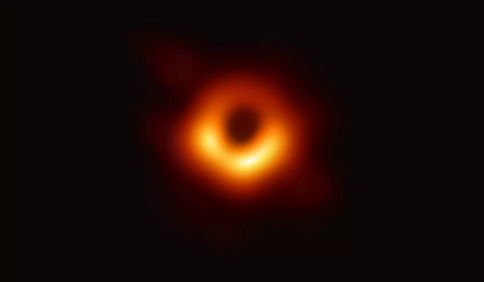
The first image of a black hole comes from M87 in April 2017. This was only published in April 2019. So almost two years later.
One of the main reasons for this was, among other things, the questions of how to a) interpret and b) visualize the collected data. The first image (as seen above) is the result of a statistical assessment of around 100 generated variants. That is, it was considered most likely that the black hole of M87
could look like this. In other words, the various scientific teams that worked in competition to interpret the data came to the conclusion that the selected variant, based on the analysis, represented the data collected most realistically. So everything was done correctly and completely ok.
What interested me, of course, were the remaining 99 variants. If you superimpose these to get an image that is the integral of all possibilities:
What was even more visible here than in the original image is the various "drains" on the outside.
This topic of "drains" is currently not “yet” discussed scientifically.
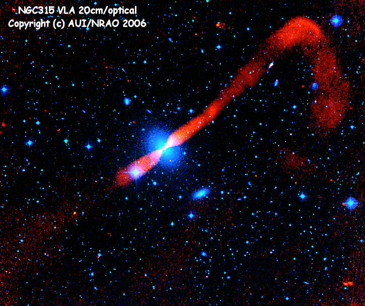
What is interesting, in the following picture from yesterday, is the fact that at M87 only the jet directed against us is visible, and the opposite jet, which also exists, is only slightly visible very close to the black hole. But there in the form of two strands.
The fact that the two opposing jets each effectively break up from two helical, twisting partial jets is clearly visible in the following image.
This might explain why up to four drains from the black hole can be visible.
But here too it is just a theory...
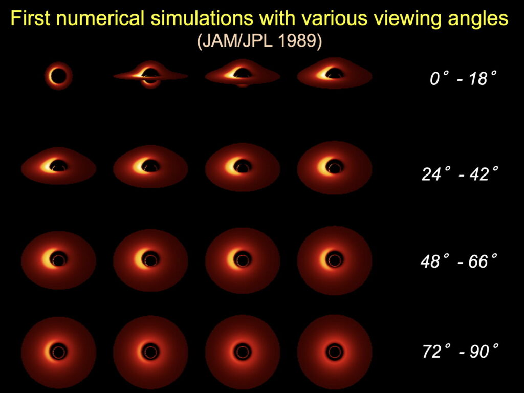
Well, back to the starting point. The first image of a black hole also raised the question of why it looks exactly as expected: black and round. (Why black and not white is a different topic...) But why is it so beautifully round on the inside? If one assumes that, according to theory, every black hole also has an accretion disk, an observation exactly from the polar axis would be pure coincidence.
I think that this question was one of the reasons why NASA commissioned their visualisation office to create this visualisation shortly after the publication of the first image (color analogies are purely coincidental). This is in order to better illustrate the scientific explanatory model for this problem.
The animation must also show that the near field of a black hole behaves physically completely differently than the "mechanistically" based behavior of the wider environment.
jac berne (flickr) NGC 383
Since the black hole is constantly changing its polar axis and rotating,
It is to be expected that the wider environment will also be “pulled along” in the direction of rotation.
jac berne (flickr) NGC 3607
In the near field, the kind of space has a completely different behavior.
This is what the animation should show.
Interestingly, the corresponding black hole image from our own galaxy shows virtually the same appearance.
at least the one that was selected

 Visualization: A Black Hole Accretion Disk


