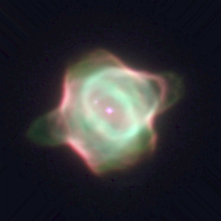
Having gone through enough of Hubble's planetary nebulas and seeing a few in wideband (albeit not R, G, and B) I am under the impression that they are very subtly colored. For instance,
this drawing is an artist's attempt to reproduce the ring nebula as he saw it through a telescope.
See more. With narrowband filters we can visually dissect a planetary nebula's composition which creates really cool rainbow-colored images. I personally love them. They are incredibly varied and I think it is a great puzzle to try to look at them all and find relationships based on shared structures. No two are alike and even if you sort through all of them you find out that we are looking at a temporally small slice and at all different angles. Maybe they are actually more similar to one another than they look but all the variables mix it up.
The following section of this post turned to a bit of a rant. I don't know if it's understandable to many people. Sorry about that.
It is important to remember that all of Hubble's pictures are both imaged according to the needs of the scientist doing the imaging which means there is no standard set of filters used at all times and that any given Hubble image could later be processed in a few different ways depending on how many and which filters were available and how person doing the processing feels about them. Any given image even of some very regular things like galaxies are subject to variations so it's not really any different for them than it is for PNe.
Here is NGC 6302. Hubble captured it in six separate narrowband filters. It's nuts to try to convey all the nuances of each filter into a single image. With that many filters it is possible to make some rough sense of the star colors, though. For some images I think it actually takes quite a bit of analysis of raw data to truly come to an understanding of what you are looking at. You can read all you want about any individual picture and come to some vague understanding by knowing which filters were used but without looking at the data itself your comprehension will remain casual and superficial.
Earlier when I mentioned the "feeling" thing I was serious. There may be three filters represented in an image but two of them were especially grainy or of poor quality so the nicer looking one ends up getting more representation than the others. This doesn't happen too often but sometimes things get rather contrived just so that an image of higher quality may be produced.
The other day I was looking at Hubble Heritage's image of the Cone Nebula and after studying it I realized both the infrared and the H-alpha were crammed into the red channel and the infrared was also being represented a bit by green and blue as well! And then there was a noisy broadband blue filter having very little effect on the picture because it was so grainy. That's an odd filter set and I understand why this was done because H-alpha is red, infrared isn't even a color, and it did look good. Still, I threw it all out the window and did it
my own way and I feel like I can see so much more of the nebula with my processing. The colors do not make any sense if all you are interested in is a "realistic" view of the nebula. One of my pet peeves is when I see a comment like, "But does it
really look like this?" Oh, gosh, I could probably write an entire essay about why yes, it really
does look like that, but your bias is preventing you from both understanding the image and appreciating it!
