Unreasonable star colors in astronomical artwork

The cosmos at our fingertips.
Post Reply
User avatar
Ann
4725 Å
Posts: 13851
Joined: Sat May 29, 2010 5:33 am

Unreasonable star colors in astronomical artwork

Post by Ann » Mon Jul 11, 2011 6:50 am

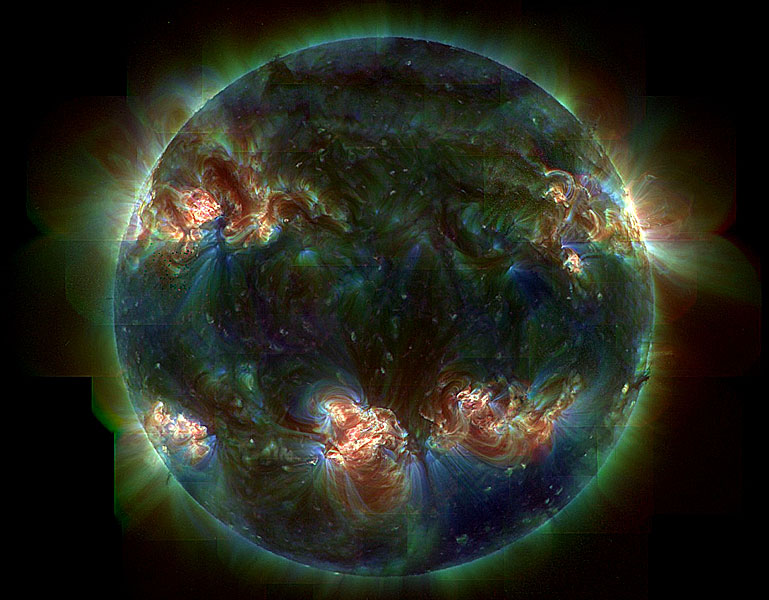
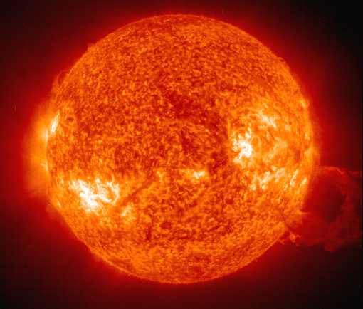
I have complained bitterly about the colors of stars in astronomical pictures, not least the color of our Sun in ultraviolet images. These images typically look like this:
The color here is a (to me) very frustrating deep, deep orange. But Chris has pointed out to me that since ultraviolet light is invisible in any case, it has to be shown in false or mapped color anyway, and then it doesn't matter what specific hue is used to show it in images. I reluctantly agree, although I still strongly dislike the deep, deep orange color.

Recently a Swedish-language ambitious magazine on astronomy was on sale in Swedish newspaper and magazine outlets. This magazine described, among other things, stellar evolution. This description started somewhat like this:

There are three kinds of stars. The first kind is the low-mass stars: The second kind is the intermediate-mass stars: The third kind is the high-mass stars: [/i]

I'm not kidding you, this magazine used exactly the same illustration of a star to represent low-mass, intermediate-mass and high-mass stars, and all of them were exactly the same orange color! Now perhaps you object that perhaps the magazine was referring to later stages of the intermediate and high-mass stars, when indeed they will be orange (though hardly ever as orange as they look in the pictures above). But in actuality, the three identical orange pictures supposedly showed the appearance of the stars when they were on the main sequence.

Is there any reason to illustrate low-mass, intermediate-mass and high-mass main sequence stars with the same deeply orange picture of a star? Absolutely not, in my opinion. Is there any excuse for doing it? Absolutely not, in my opinion. (Oh, and by the way, since the same orange picture of a star was shown to describe low-mass, intermediate-mass and high-mass stars, not only were the stars shown to be the same color, they were also shown to be the same size!)

Well, I'm not suggesting that whoever put that Swedish-language magazine together knew what they were doing. Fortunately, this magazine is not likely to circulate its lies about stars far beyond the borders of Sweden and the small fraction of the total population of 9 million Swedes who are astronomy fans.

But when it comes to the Hubble Telescope, those who will see and believe in the pictures are just so much more numerous. Which is exactly why it is far more serious when the color of Hubble images are obviously wrong.

But before I show you what I mean, let's return to one of those "conventional truths" about stars that get their colors so extremely wrong. I said before that I reluctantly agree with Chris that it may be all right to show the ultraviolet light of the Sun as orange, since the ultraviolet light is invisible in any case and must be shown as false or mapped color anyway.

But I seriously think that it should be made clear that the orange color that we see so often in pictures of the Sun is mapped color!! Not true color!!!

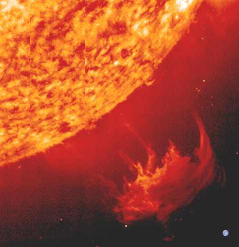
Okay. Now take a look at a picture which mixes the mapped orange color of the Sun with the more or less true colors of the Earth: Here you can see the very orange mapped color disk of the Sun, plus a large red solar flare, plus a more or less true RGB color image of the Earth at lower left.

This picture mixes mapped color and true RGB color, strengthening the impression that the Sun is "really" orange.

Okay, now for the latest Hubble image, an artist's impression of a distant sun and its planet:
Hmmm. The sun looks extremely yellow, while the planet looks sort of aqua-colored and brown. The planet looks like a mixture of Jupiter and Uranus. That could be the true color of an alien planet.

But what about the color of that alien sun?

It is very yellow. Okay, if the star is very low-mass, it could be as yellow as that for real. The same could be true if the star in an evolved giant. The color of Arcturus, a K2 giant, looked as yellow as that when I observed it once through a telescope. (But on other occasions Arcturus has looked much paler to me.)

Ah. But hear now what the caption says about the star and the planet:
July 5, 2011: NASA's Hubble Space Telescope crossed another milestone in its 21-year space odyssey of exploration and discovery. On Monday, July 4, the Earth-orbiting observatory logged its one millionth science observation during a search for water in an exoplanet's atmosphere 1,000 light-years away. Although Hubble is best known for its stunning imagery of the cosmos, the millionth exposure is a spectroscopic measurement, where light is divided into its component colors. These color patterns can reveal the chemical composition of cosmic sources. This is an artist's concept of Hubble's millionth exposure, the extrasolar planet HAT-P-7b. It is a gas planet larger than Jupiter orbiting a star hotter than our Sun. HAT-P-7b, also known as Kepler 2b, has been studied by NASA's planet-hunting Kepler observatory after it was discovered by ground-based observations.
So the star is hotter than the Sun. Then its color will necessarily be bluer than the color of the Sun. All right, but since the Sun is orange, then it makes good sense that that other star is yellow, right? Because yellow is a bluer color than orange, right?

Right. And wrong. Yes, yellow is a bluer color than orange. But no, the Sun is not orange!!!

If that star is hotter than the Sun, the artist should at the very least have shown it as white. Better yet, he(?) should have shown it as a pale blue color.

And if people don't understand that a bright white round object could be a sun, then that just goes to show how much people have been lied to about the color of stars.
The Sun?

Ann
Color Commentator

User avatar
Ann
4725 Å
Posts: 13851
Joined: Sat May 29, 2010 5:33 am

Re: Unreasonable star colors in astronomical artwork

Post by Ann » Mon Jul 11, 2011 9:32 am

Image

Father: Son, I'll give you a dollar if you can tell me the color of the Sun.

Son: That's easy, dad! I used to think it was yellow. You know all the pictures I've seen in kiddie books! But now I've seen a real astronomy book with real pictures of the Sun. You know the pictures made by real astronomers! So now I know the Sun is orange!

Father: OK. Here you are.

Ann
Color Commentator

User avatar
Ann
4725 Å
Posts: 13851
Joined: Sat May 29, 2010 5:33 am

Re: Unreasonable star colors in astronomical artwork

Post by Ann » Mon Jul 11, 2011 10:26 am

Image

Father: Wait, I've changed my mind. The Sun can't be orange. I'm sure I've heard that it's a yellow dwarf.

Son: Yeah, that's true. It's a dwarf. It's really itty bitty small. And it's kind of yellow. But not like the kiddie books' kind of yellow. It's a really orange kind of yellow.

Father: OK. Here you are.

Ann
Color Commentator

User avatar
owlice
Guardian of the Codes
Posts: 8406
Joined: Wed Aug 04, 2004 4:18 pm
Location: Washington, DC

Re: Unreasonable star colors in astronomical artwork

Post by owlice » Mon Jul 11, 2011 11:41 am

Ann wrote:I have complained bitterly about the colors of stars in astronomical pictures, not least the color of our Sun
Indeed you have, many times. I'll point out that a letter to the magazine in question would probably be a more fruitful direction in which to express your ire. Though I haven't seen the publication, nor do I expect to ever do so, I strongly suspect that the three identical images were used as placeholders, as happens when doing layout, and not replaced when the time came to replace them. So... an error. Please let them know of your disappointment.

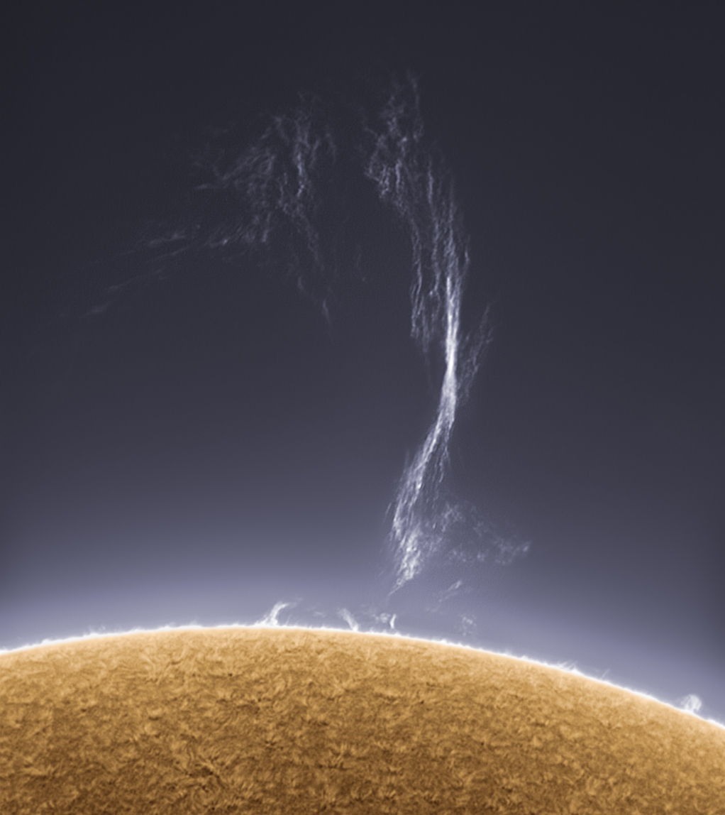
I happen to like the choice of deep orange for sun images; I also like blue for the sun. Here is one of my favorite sun images, this by Alan Friedman:
[attachment=0]friedman.jpg[/attachment]

I also like his choice of yellow-orange here: (Love the title of this image, too: Tallest of Allest!)

And César Cantú's lovely yellow here:
[attachment=2]sun.jpg[/attachment]
Ah, that's golden! Looks like waving wheat (which sures smells sweet when the wind comes right behind the rain). I think that's a lovely, lovely color for the sun. Shows off the texture very well.

And I think an image such as this, by Jesús Carmona de Argila, shows the sun off magnificently; the contrast of surface to spot is excellent and wow, does that Earth look tiny! Why, it would fit right in that sunspot, no problem! And look how small the moon is, in the lower left corner!
[attachment=1]argila.jpg[/attachment]
Love that deep orange. Surely is a pretty sun, and I'm glad to have it in every, and any, color.
Attachments
Click to view larger image
A closed mouth gathers no foot.

User avatar
neufer
Vacationer at Tralfamadore
Posts: 18805
Joined: Mon Jan 21, 2008 1:57 pm
Location: Alexandria, Virginia

Thank god they didn't have to rhyme orange!

Post by neufer » Mon Jul 11, 2011 1:33 pm

Ann wrote:
And if people don't understand that a bright white round object could be a sun,
then that just goes to show how much people have been lied to about the color of stars. The Sun?
Click to play embedded YouTube video.
He: Tangerine, she is all they claim
With her eyes of night and lips as bright as flame
Tangerine, when she dances by, senoritas stare and caballeros sigh
And I've seen toasts to Tangerine
Raised in every bar across the Argentine
Yes, she has them all on the run,
. but her heart belongs to just one
Her heart belongs to Tangerine


She: Tangerine, she is all they say
With mascara'd eye and chapeaux by Dache.
Tangerine, with her lips of flame
If the color keeps, Louis Philippe's to blame.
And I've seen clothes on Tangerine
Where the label says "From Macy's Mezzanine".
Yes, she's got the guys in a whirl,
. but she's only fooling one girl
She's only fooling Tangerine!
http://en.wikipedia.org/wiki/Tangerine_%281941_song%29 wrote:
"Tangerine" is a popular song. The music was written by Victor Schertzinger, the lyrics by Johnny Mercer. It was introduced in the 1942 movie, The Fleet's In, produced by Paramount Pictures, directed by Schertzinger, and starring Dorothy Lamour, William Holden, Eddie Bracken, singer Cass Daley, and Betty Hutton in her feature film debut. The tune was featured as background music in the movie Star Trek III: The Search for Spock. The most popular recorded version of the song was made by the Jimmy Dorsey Orchestra with vocalists Helen O'Connell and Bob Eberly. The recording was released by Decca Records as catalog number 4123. The record first reached the Billboard charts on April 10, 1942 and lasted 15 weeks on the chart, peaking at #1. The lyrics in this version differ slightly from those in the movie. On the record, Eberle sings "And I've seen toasts to Tangerine/Raised in every bar across the Argentine," the lyric that became standard. In the movie at that point, the line is "And I've seen times when Tangerine/Had the bourgeoisie believing she was queen."
http://en.wikipedia.org/wiki/Tangerine wrote:
<<Tangerines have been cultivated for over 3,000 years in China. They are also high in concentration in present day Burma. Tangerines are a good source of vitamin C, folate and beta-carotene.They also contain some potassium, magnesium and vitamins B1, B2 and B3. Tangerine oil, like all citrus oils, has limonene as its major constituent, but also alpha-pinene, myrcene, gamma-terpinene, citronellal, linalool, neral, neryl acetate, geranyl acetate, geraniol, thymol, and carvone. New research has discovered a substance in tangerines that not only prevents obesity, but also offers protection against type 2 diabetes.>>
Art Neuendorffer

User avatar
rstevenson
Quis custodiet ipsos custodes?
Posts: 2705
Joined: Fri Mar 28, 2008 1:24 pm
Location: Halifax, NS, Canada

Re: Unreasonable star colors in astronomical artwork

Post by rstevenson » Mon Jul 11, 2011 1:37 pm

Can anyone supply a photo of the sun taken through a neutral density filter? No colour filters, no post-processing or colour manipulation of any kind, just a reduction in light until we can see the sun and some of its surface detail instead of just glare. What colour is it then?

I know, it gets complicated when you take three or more B&W images through three or more filters and then combine them. But what I mean is the simplest possible process, exactly similar to what you would do taking a terrestrial picture of a normally sunlit scene. Just stop the lens down and use a neutral density filter to get below the glare level, in the same sense as looking with your eyes through such a filter, if only our eyes could magnify the sun sufficiently. (I don't have a telescope or I'd do the deed myself.)

Rob

User avatar
owlice
Guardian of the Codes
Posts: 8406
Joined: Wed Aug 04, 2004 4:18 pm
Location: Washington, DC

Re: Thank god they didn't have to rhyme orange!

Post by owlice » Mon Jul 11, 2011 1:38 pm

neufer wrote:
http://en.wikipedia.org/wiki/Tangerine wrote:
<<Tangerines have been cultivated for over 3,000 years in China. They are also high in concentration in present day Burma. Tangerines are a good source of vitamin C, folate and beta-carotene.They also contain some potassium, magnesium and vitamins B1, B2 and B3. Tangerine oil, like all citrus oils, has limonene as its major constituent, but also alpha-pinene, myrcene, gamma-terpinene, citronellal, linalool, neral, neryl acetate, geranyl acetate, geraniol, thymol, and carvone. New research has discovered a substance in tangerines that not only prevents obesity, but also offers protection against type 2 diabetes.>>
And, unlike M&Ms, they are so easy to peel!
A closed mouth gathers no foot.

User avatar
neufer
Vacationer at Tralfamadore
Posts: 18805
Joined: Mon Jan 21, 2008 1:57 pm
Location: Alexandria, Virginia

Re: Thank god they didn't have to rhyme orange!

Post by neufer » Mon Jul 11, 2011 2:14 pm

owlice wrote:
And, unlike M&Ms, they are so easy to peel!
Tangerine: the sweet orange with a peel!
http://en.wikipedia.org/wiki/M%26M%27s wrote:
<<M&M's (named after the surnames of the company founders Mars & Murrie) are dragée-like "colorful button-shaped candies" produced by Mars, Incorporated. The candy shells, each of which has the letter "m" printed in lower case on one side, surround a variety of fillings, including milk chocolate, dark chocolate, crisped rice, mint chocolate, peanuts, almonds, orange chocolate, coconut, pretzel, wild cherry, and peanut butter. M&M's originated in the United States in 1941, and are now sold in over 100 countries. They are produced in different colors, some of which have changed over the years. The difference between the different colored M&Ms is the dye added to the outer coating.
Red candies were eliminated in 1976 due to health concerns over the dye amaranth (FD&C Red #2), which was a suspected carcinogen, and were replaced with orange-colored candies. This was done despite the fact that M&M's did not contain the dye; the action was purely to satisfy worried consumers. Red candies were reintroduced later, but they also kept the orange colored M&M's. They currently contain Allura Red AC (FD&C Red #40, E129). In Europe, Allura Red AC is not recommended for consumption by children. It is banned in Sweden, Denmark, Belgium, France, Germany, Switzerland, Austria, and Norway. Instead, Cochineal (E120) is used in the red shells. However vegans, Jews, Muslims, and other people who don't eat insects [e.g., Owlice], have a problem with the (E120) colour.

In 1995, Mars ran a promotion in which consumers were invited to vote on which of blue, pink, or purple would replace the tan M&M's. Blue was the winner, replacing tan in early 1995. Concurrent with the Blue M&M campaign, M&M's introduced computer animated "spokescandies" in their television commercials. These include:
  • 1) the team of the cynical and sardonic "Red" (originally voiced by Jon Lovitz, thereafter Billy West), who is the mascot for milk chocolate M&M's, and
    2) the happy and gullible "Yellow" (originally John Goodman, thereafter J.K. Simmons), who is the mascot for peanut M&M's.
Other mascots include:
  • 3) the "cool one", Blue (Phil Hartman, thereafter Billy West) for almond;
    4) the seductive Green (Cree Summer) for peanut butter, coconut, and dark chocolate (Green is the only female M&M's mascot); and
    5) the slightly neurotic Orange (Eric Kirchberger) for crispy and pretzel M&M's.
Although brown M&Ms have been around since the beginning of the candy, no brown M&M "spokescandy" was included.

In the summer of 2005, Mars added "Mega M&M's" to the lineup. These candies, at 55% larger than the traditional M&M's, were a little smaller than the ogre-sized version. They were available in milk chocolate and peanut varieties. The colors for Mega M&M's were changed to less-bright colors – teal (replacing green), beige (orange), maroon (red), gold (yellow), blue-gray (blue), and brown to appeal to a more adult consumer.

In July 2006, Dark Chocolate M&M's reappeared in a purple package, followed in 2007 by Dark Chocolate Peanut M&M's. Also in 2006, the company piloted White Chocolate M&M's as a tie-in with their Pirates of the Caribbean promotion. The company also offered eight new flavors of M&M's via online sales, as well as at M&M's World locations: "All That Razz"; "Eat, Drink, & Be Cherry"; "A Day at the Peach"; "Orange-U-Glad"; "Mint Condition"; "AlmonDeeLicious"; "Nut What You Think" and "Cookie Minster".>>
Art Neuendorffer

User avatar
owlice
Guardian of the Codes
Posts: 8406
Joined: Wed Aug 04, 2004 4:18 pm
Location: Washington, DC

Re: Unreasonable star colors in astronomical artwork

Post by owlice » Mon Jul 11, 2011 4:25 pm

Mega M&Ms? :shock:

I'm not sure I really needed to know about these...!!
A closed mouth gathers no foot.

User avatar
Beyond
500 Gigaderps
Posts: 6889
Joined: Tue Aug 04, 2009 11:09 am
Location: BEYONDER LAND

Re: Unreasonable star colors in astronomical artwork

Post by Beyond » Mon Jul 11, 2011 4:30 pm

Speaking of M&M's, here's a round peanut M&M i found while munching through a bag.
I don't know if it's an M&M representation of an eruption on the sun(in orange color),
or if it's an M&M bomb with a short fuse.
IMG_1381-APOD.jpg
To find the Truth, you must go Beyond.

User avatar
Chris Peterson
Abominable Snowman
Posts: 18601
Joined: Wed Jan 31, 2007 11:13 pm
Location: Guffey, Colorado, USA
Contact:

Re: Unreasonable star colors in astronomical artwork

Post by Chris Peterson » Mon Jul 11, 2011 5:26 pm

Ann wrote:But what about the color of that alien sun?
Well, that sun has a temperature of 6350K. What "color" should we see that as?
color6350.jpg
color6350.jpg (3.82 KiB) Viewed 3744 times
This shows a set of RGB approximations for a 6350K blackbody. The first block is how a star would probably appear to our eyes- white, since we'd be saturated. If we used a dark filter to get into the sensitivity range of our eyes, it would look like the second block. The third and fourth blocks are the same spectral mix, just viewed through successively darker filters. This emphasizes the point that "color" is a physiological phenomenon. Spectrally, all the blocks (except the first) are identical, but they clearly are perceived as very different colors.

So how should the artist have represented this star system to convey the most information? Well, here is how it would appear if you were approaching the planet in a spaceship:
hubble_1a.jpg
hubble_1a.jpg (8.86 KiB) Viewed 3744 times
This is very accurate, but not very interesting. So lets put a nice filter on our window, so we can see some color in the star:
hubble_1b.jpg
This is pretty accurate as well. Of course, since we are viewing in white light, we've lost all the activity above the photosphere, as well as most of the contrast. And in both cases, we see no detail on the planet. Since we're viewing it from its shadowed side, we will probably never see anything but a black circle. If we boost the intensity enough to see anything more, of course, the star will be saturated white.

I think the representation by the artist is quite acceptable.
If that star is hotter than the Sun, the artist should at the very least have shown it as white. Better yet, he(?) should have shown it as a pale blue color.
Spectrally, this star contains more red and more green than blue. Dimmed down enough, it is still a pale yellow-orange to the eye.
Chris

*****************************************
Chris L Peterson
Cloudbait Observatory
https://www.cloudbait.com

User avatar
Chris Peterson
Abominable Snowman
Posts: 18601
Joined: Wed Jan 31, 2007 11:13 pm
Location: Guffey, Colorado, USA
Contact:

Re: Unreasonable star colors in astronomical artwork

Post by Chris Peterson » Mon Jul 11, 2011 5:38 pm

rstevenson wrote:Can anyone supply a photo of the sun taken through a neutral density filter? No colour filters, no post-processing or colour manipulation of any kind, just a reduction in light until we can see the sun and some of its surface detail instead of just glare. What colour is it then?
sun_white.jpg
sun_white.jpg (8.15 KiB) Viewed 3743 times
This is the Sun imaged with a DSLR and Baader neutral density film (which might have just a hair of a blue cast). On my monitor it is pretty close to the visual appearance at the eyepiece using the same filter.

FWIW, this is the same image using the HEAT color map. I think it pretty clearly shows how transforming intensity information (which is about all there is in the first image) to both intensity and color yields an image we can extract more data from visually.
sun_heat.jpg
sun_heat.jpg (16.93 KiB) Viewed 3743 times
Chris

*****************************************
Chris L Peterson
Cloudbait Observatory
https://www.cloudbait.com

User avatar
Ann
4725 Å
Posts: 13851
Joined: Sat May 29, 2010 5:33 am

Re: Unreasonable star colors in astronomical artwork

Post by Ann » Mon Jul 11, 2011 7:04 pm

Chris Peterson wrote:
I think the representation by the artist is quite acceptable.
I don't agree with you, Chris. In this topic, http://asterisk.apod.com/viewtopic.php?f=8&t=23670, I discuss the color of F5 star Procyon and F stars in general, and I argue that these stars are actually blue, though we are talking about a very pale and whitish shade of blue. My main argument for saying that F-type stars are a very pale shade of blue is that they are hotter and bluer than the Sun. And the Sun is white. You showed it yourself, Chris, in your photo of the Sun. The reason why the Sun is white is of course that it is most expedient for us humans to see the total light output of the Sun as white. (More specifically, we see the total light output of the Sun that we can detect with the cones in our retinas as white.)

I certainly wouldn't have minded seeing that alien star shown as white, since its color is definitely very close to white anyway. I also would have found it acceptable if the the star had been shown as a very, very pale yellowish-white. The bright, saturated yellow color in an illustration of an F star is, however, not acceptable to me. Frankly, I think the artist should know better, and I think the people of NASA should care more!

Give me a whiter shade of pale for the F stars any day!
Click to play embedded YouTube video.
Ann
Color Commentator

User avatar
Chris Peterson
Abominable Snowman
Posts: 18601
Joined: Wed Jan 31, 2007 11:13 pm
Location: Guffey, Colorado, USA
Contact:

Re: Unreasonable star colors in astronomical artwork

Post by Chris Peterson » Mon Jul 11, 2011 8:11 pm

Ann wrote:I certainly wouldn't have minded seeing that alien star shown as white, since its color is definitely very close to white anyway. I also would have found it acceptable if the the star had been shown as a very, very pale yellowish-white. The bright, saturated yellow color in an illustration of an F star is, however, not acceptable to me. Frankly, I think the artist should know better, and I think the people of NASA should care more!
My point was simply that the image can't be represented in natural color or intensity in any case. The dynamic range is far too wide. And since the artist is obviously not attempting to render the star in natural color (or there would be no prominences), the choice of color is arbitrary. In fact, since this view probably comes closest to the scene in H-alpha, the orange color shown is actually much closer to reality than a nearly white color would show. Bright red would be best, of course.

This rendering is attempting to convey a concept, not an actual photographic view. If you want the latter, my renderings are much more accurate. But pretty uninteresting.
Chris

*****************************************
Chris L Peterson
Cloudbait Observatory
https://www.cloudbait.com

User avatar
BMAONE23
Commentator Model 1.23
Posts: 4076
Joined: Wed Feb 23, 2005 6:55 pm
Location: California

Re: Unreasonable star colors in astronomical artwork

Post by BMAONE23 » Mon Jul 11, 2011 9:19 pm

Last edited by BMAONE23 on Tue Aug 30, 2011 3:31 am, edited 2 times in total.
Reason: Changed link to smaller image, and I like this one, too; it's *very* cool!

User avatar
rstevenson
Quis custodiet ipsos custodes?
Posts: 2705
Joined: Fri Mar 28, 2008 1:24 pm
Location: Halifax, NS, Canada

Re: Unreasonable star colors in astronomical artwork

Post by rstevenson » Mon Jul 11, 2011 9:28 pm

Thanks for your explanations Chris, both in answer to my question and to Ann's observations. You've shed some light on the subject. :)

My eyes can't see a colour in the first image you posted (in response to my question) but my trusty digital colour metre tells me there is a tiny bit more red in it than either green or blue, from which I conclude that our Sun lies just on the warm side of white -- and by "white" i mean the neutral point between the warm end of the spectrum and the cold end, that colour which would appear "neutral gray" (an old photographic term not much used in this digital age) to our limited eyes through a sufficiently dense filter.

I need to go and do a little studying about black body radiation and effective temperature and other such arcana. Wish me luck!

Rob

User avatar
rstevenson
Quis custodiet ipsos custodes?
Posts: 2705
Joined: Fri Mar 28, 2008 1:24 pm
Location: Halifax, NS, Canada

Re: Unreasonable star colors in astronomical artwork

Post by rstevenson » Mon Jul 11, 2011 9:30 pm

BMAONE23 wrote:I"ve always liked This SUN
Reminds me of some icing I made when I was but a mere lad. The best part of it was that no one else wanted to eat the cake, so I had it all to myself.

Rob

User avatar
Chris Peterson
Abominable Snowman
Posts: 18601
Joined: Wed Jan 31, 2007 11:13 pm
Location: Guffey, Colorado, USA
Contact:

Re: Unreasonable star colors in astronomical artwork

Post by Chris Peterson » Mon Jul 11, 2011 10:20 pm

rstevenson wrote:My eyes can't see a colour in the first image you posted (in response to my question) but my trusty digital colour metre tells me...
I'm pretty sure that even in countries that measure things in metres, that would be a color meter.
... and by "white" i mean the neutral point between the warm end of the spectrum and the cold end, that colour which would appear "neutral gray" (an old photographic term not much used in this digital age) to our limited eyes through a sufficiently dense filter.

I can assure you, the term "neutral gray" is in more use in digital imaging than it ever was in traditional photography. It is in no danger of becoming obsolete.
Chris

*****************************************
Chris L Peterson
Cloudbait Observatory
https://www.cloudbait.com

User avatar
neufer
Vacationer at Tralfamadore
Posts: 18805
Joined: Mon Jan 21, 2008 1:57 pm
Location: Alexandria, Virginia

Re: Thank god they didn't have to rhyme orange!

Post by neufer » Thu Jul 14, 2011 7:50 pm

owlice wrote:
And, unlike M&Ms, they are so easy to peel!
http://www.msnbc.msn.com/id/43758286/ns/technology_and_science-space/ wrote:
M&M's melt in your mouth, not as you launch <<In the hours that led up to NASA's final space shuttle launch last Friday, the launch and mission control teams, as well as the astronauts flying on board shuttle Atlantis, received a sweet surprise: special space shuttle-themed M&M's candies. The red, blue and silver " candy-coated chocolates " – as NASA has generically labeled them ever since they flew aboard the first shuttle mission in 1981 – were in small metal tins. Marked with their trademark "m" on one side, the candies were decorated on the reverse with either a small image of the shuttle orbiter, the phrase "3... 2... 1... Lift Off!" or the date of the launch, "July 8, 2011."

"We've been honored to fly on more than 130 missions with hundreds of American heroes over the last three decades," said Debra Sandler, chief consumer officer for Mars Chocolate North America, whose products include M&M's. "It's bittersweet to see this program, which has inspired millions to reach for the stars, come to an end, but we wish the crew of Atlantis a safe and successful mission," she said in a statement. The STS-135 astronauts — commander Chris Ferguson, pilot Doug Hurley and mission specialists Sandy Magnus and Rex Walheim — received M&M's personalized with their names.

One of the most well-known examples of the off-the-shelf foods flown on the space shuttle, M&M's have been eaten on the winged spacecraft since the STS-1 crew requested them on the shuttle Columbia when they lifted off on April 12, 1981. The candies' small shape and colorful assortment have made them a favorite for astronauts, not just to eat but to play within the microgravity environment on the shuttle. It has been a common sight over the past three decades to see shuttle crew members tossing the M&M's between them, catching them in their mouths, or playing Pac-Man — chomping on a floating line up of the candy pieces.

NASA, as a federal agency, has been eager to avoid the appearance of commercial endorsements, so when then candies flew, they were removed from their packaging, placed in vacuum-sealed clear pouches and identified only as "candy-coated chocolates." The M&M's retained their letter "m" markings, though. The candies remained more or less generic until astronaut Shannon Lucid spent 188 days aboard the Russian space station Mir in 1996. When asked what she missed most back on Earth, she replied from orbit, "I guess the only thing that would be nice is to have a few more M&M's." Her confession led to both the NASA administrator and president of the United States presenting Lucid with many pounds of M&M's upon her landing on the space shuttle.

The Mars Chocolates company also packaged red, white and blue M&M's to give to her and visitors to the Kennedy Space Center. M&M's will continue to be consumed in space aboard the International Space Station. Space shuttle Atlantis, flying this final shuttle flight, has the almond-variety on board, or "candy-coated almonds." The crew's personalized M&M's remained on the ground.>>
Art Neuendorffer

Post Reply